Challenge
The challenge of the project was to revitalize the B2B Match brand, which had faced challenges since its launch related to visual application and brand cohesion. These issues negatively affected the desired perception over time. The analysis revealed a lack of organized communication structure, with frequent associations damaging the brand's image due to a lack of visual cohesion. Additionally, B2B Match is part of a brand architecture that includes five other brands, requiring a cohesive visual identity that ensured continuity among all the involved brands.
Solution
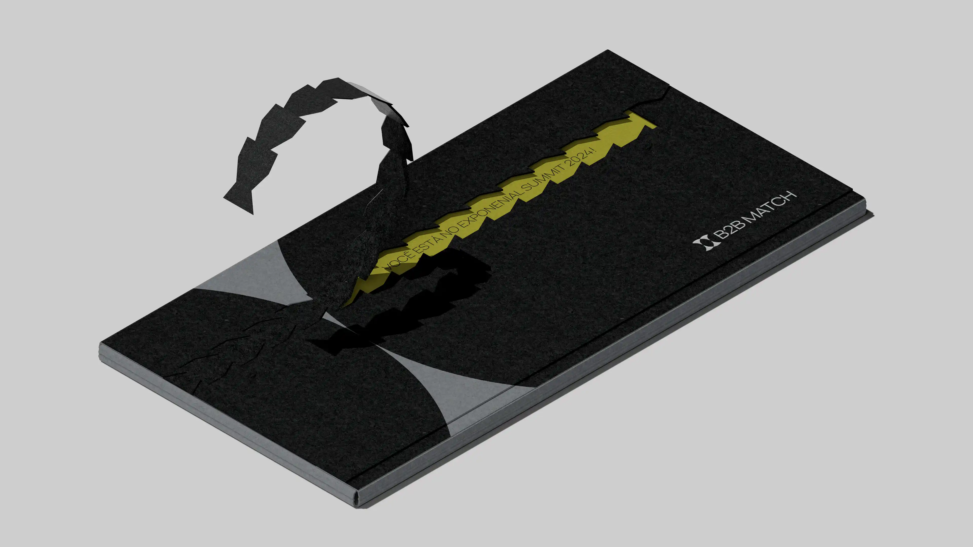
From the initial analyses conducted during the research and diagnostic stages, we realized that the brand needed to be dynamic and adaptable to the other brands in the group. With this in mind, we aimed to develop communication that reflected a functional and applicable concept to all of them. Thus, we created a symbol from which it was possible to build a replicable visual identity, thanks to its simplicity of application.
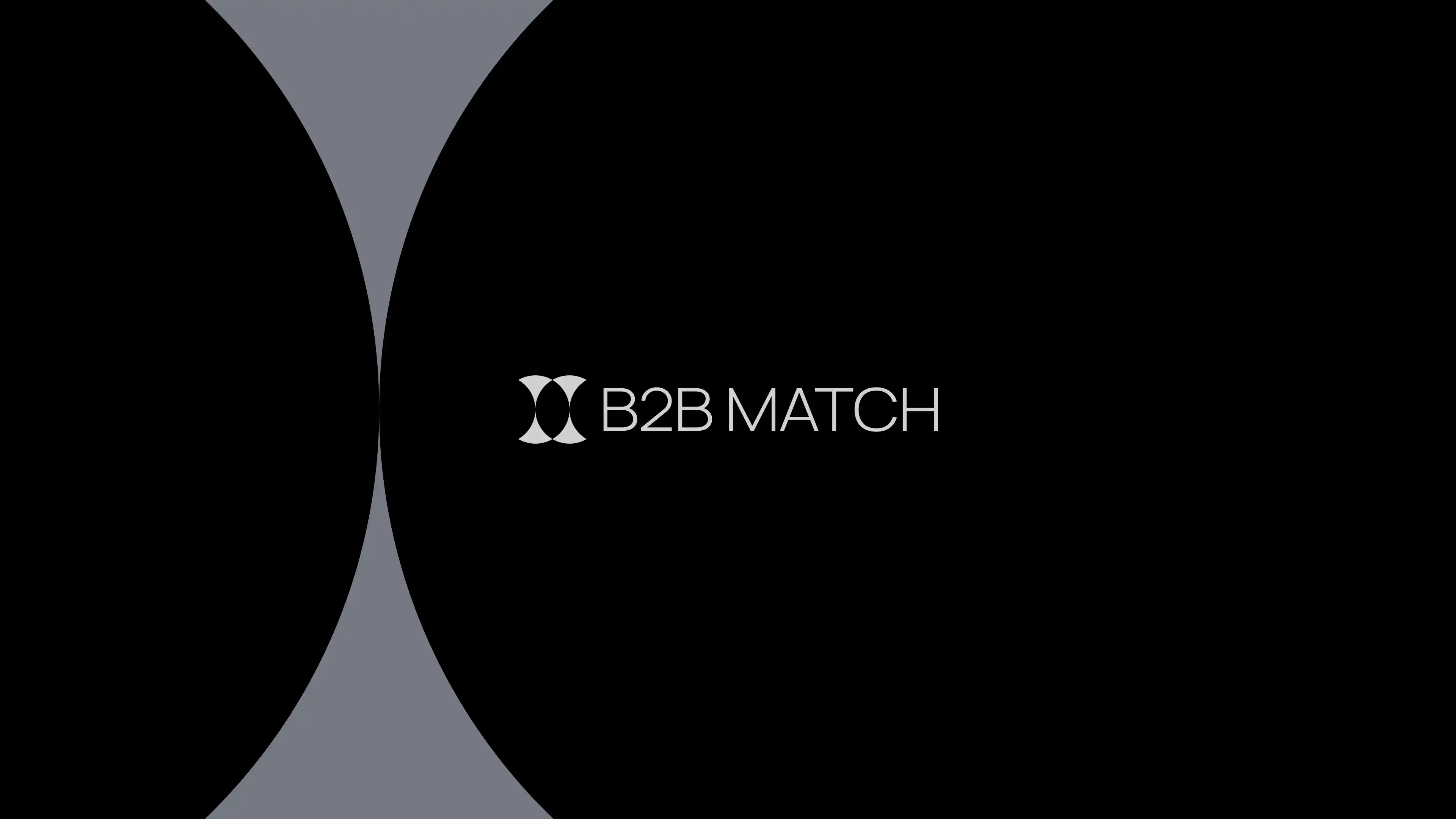
Our symbol consists of symmetrically increasing shapes that form a circle around a central empty space, representing the elegant and harmonious union of leaders, ideas, and businesses.
The colors chosen are also a fundamental part of this process: the main identity is monochromatic, while specific colors are used to distinguish each event or experience, thus ensuring a cohesive visual unit.


Team: Gabriel Sauer, Eduardo Matos, Vinícius Germano Müller and Emanuel Peres (Motion Designer)